

Article: Mother of the Bride Dress Colors: The Most Flattering Shades for Spring Weddings
Mother of the Bride Dress Colors: The Most Flattering Shades for Spring Weddings
At some point between choosing flowers, guest lists and venue, a big question arrives: what color should you wear as the mother of the bride?
You know your dress will be in the photos, the aisle walk, the speeches and all the little in-between moments. The right color should feel flattering in real life, look beautiful in pictures and sit comfortably beside the bridal party rather than competing with it.
This guide walks through the most flattering dress colors for spring weddings so you can feel confident choosing from the many mother of the bride dresses available.

1. Start with the couple’s palette, then think about you
Most couples have at least a loose color palette for their day. It might be on the invitation, the wedding website or in the bridesmaids’ dresses. Use it as a guide, not a rulebook.
Ask yourself:
-
Are the bridesmaids wearing pastels, deeper jewel tones or neutrals
-
Is the overall feel soft and romantic, bright and modern or classic and simple
-
Will most of the photos be taken outdoors in daylight or indoors in softer evening light
Once you have that picture in mind, you can look at spring mother of the bride dresses in shades that sit near the palette rather than copying it exactly. The idea is harmony & coordination, not to match.

2. Elegant neutrals that flatter almost everyone
Soft neutrals are some of the easiest and most forgiving choices for spring.
-
Champagne and soft gold
These shades pick up the warmth in candles, fairy lights and afternoon sun. They are especially pretty in chiffon, lace and gentle shimmer. Try tones similar to the ones in champagne dresses if you like a glow that feels delicate rather than loud. -
Dove grey and silver
Cool-toned neutrals can be incredibly flattering, especially with cool skin tones or silver hair. Fabrics that gently catch the light, like grey and silver dresses, tend to photograph beautifully without stealing focus. -
Soft taupe and stone
These sit between warm and cool, which makes them easy to pair with many wedding palettes. They also work well if you prefer a more understated look and want to bring interest through texture or subtle beading.
Neutrals are a good starting point if you are unsure about color but still want to feel dressed for the occasion.

3. Classic blues and greens for spring
Spring is a natural time to lean into blues and greens, especially for outdoor or destination settings.
-
Navy and midnight blue
These shades are classics for a reason. They slim visually, flatter most skin tones and work in both daytime and evening light. Navy dresses feel formal enough for a hotel ballroom but still soft enough for a vineyard or garden venue. -
Soft blue tones
Powder blue, sky and light teal bring a gentle freshness that feels right at home in spring. Look for versions close to the hues in blue dresses if the couple’s palette includes cool tones or lighter pastels. -
Fresh greens
Sage, soft olive and other muted greens echo the surroundings in garden and vineyard settings. Dresses similar to the tones in green styles can look especially good against foliage in photos.
These shades work well when you want a bit more color than a neutral without feeling too bright.

4. Pastels and florals for romantic settings
If the wedding has a softer, romantic feel, pastels and delicate prints are an easy way to echo the mood.
-
Pastel pinks, mauves and lilacs
These colors suit many skin tones and feel naturally tied to spring flowers. Explore shades close to pastel evening styles if the bridesmaids are in similar tones and you want to sit nearby on the color wheel without matching exactly. -
Floral prints
A floral dress can be a beautiful choice for gardens, vineyards and destination weddings with a relaxed feel. Smaller, more delicate prints like floral dresses tend to suit mothers of the bride particularly well, since they add interest without overwhelming the overall look.
If the bride is wearing lots of texture or lace, a simpler pastel can be a nice contrast. If her gown is clean and minimal, a softly printed dress can bring a bit of movement into photos.

5. Jewel tones and metallics for evening spring weddings
Some spring weddings lean more formal, with candlelit rooms, richer flowers and evening receptions. In those settings, deeper colors and a little shimmer can feel very at home.
-
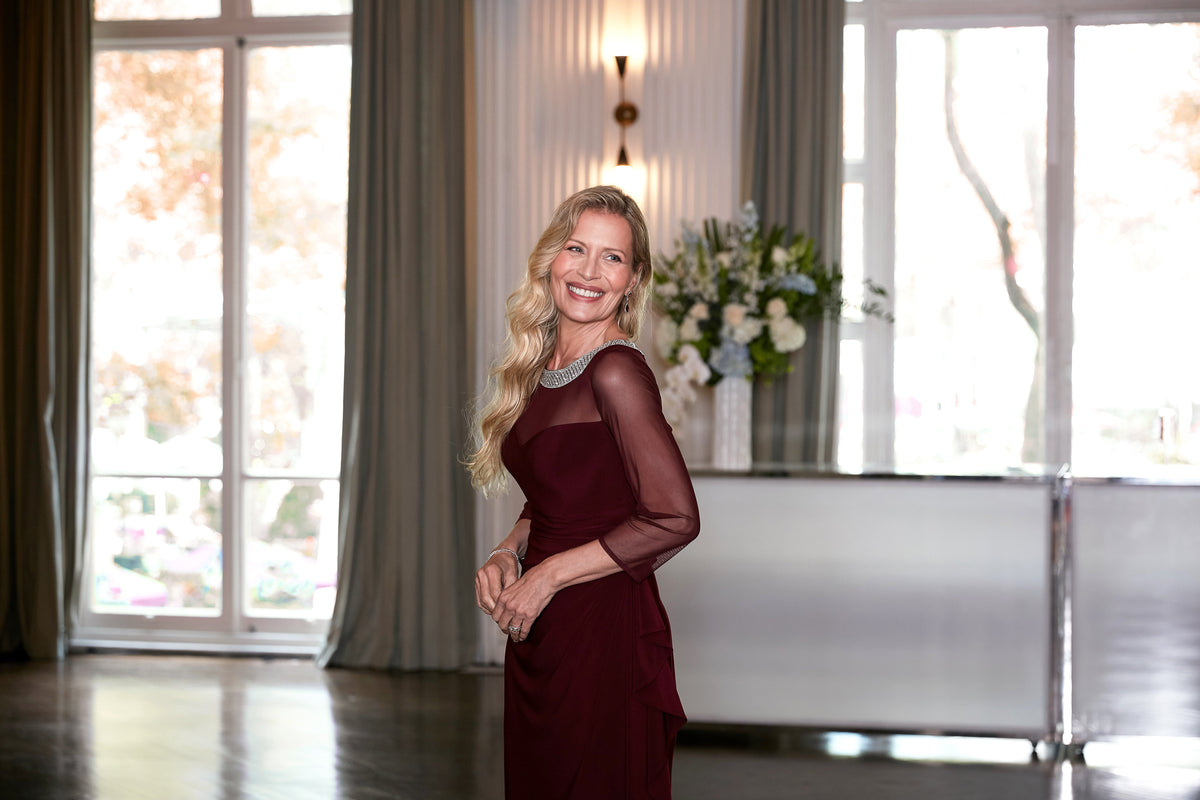
Eggplant, wine and deep teal
These jewel tones feel celebratory and look especially striking in lower light. They can be flattering on both fair and deeper skin tones and pair well with metallic accessories. -
Soft metallic dresses
You do not need full sparkle for a sense of shine. Subtle metallic fabrics similar to those in metallic evening dresses give a gentle sheen that works beautifully under chandeliers and candlelight. -
Consider sequin placement
If you love sparkle, a dress with thoughtful sequin placement, sequin styles, can light up photos without feeling too bold. Look for sequins concentrated at the bodice or sleeves if you prefer to keep the skirt softer.
These choices are often ideal when the wedding feels more like an evening gala than a daytime garden party.

6. Colors to approach thoughtfully
There are very few strict rules anymore, but a few colors are worth discussing with the couple.
-
True white and ivory
These are usually reserved for the bride unless she has specifically said she wants her mother in a similar shade as part of an all-neutral look. -
Very bright neon shades
Electric colors can pull focus away from the couple in photos. If you love bold color, try a rich jewel tone instead of neon. -
Exact bridesmaid colors
Wearing the exact same shade as the bridesmaids can make you look like part of the bridal party rather than the mother of the bride. Choosing a neighboring tone in the same family keeps things cohesive without blurring roles.
If you are ever unsure, a quick conversation with your daughter usually clears it up.
7. How to choose the right color for you
Once you have a sense of what suits the venue and the palette, come back to how you want to feel.
Ask yourself:
-
Do I feel brighter and more awake in cooler tones or warmer ones
-
Do softer shades make me feel calm and elegant, or do I naturally reach for deeper colors
-
When I picture myself in the family photos, which colors feel the most like me
Then try on a few spring mother of the bride styles that line up with those answers. Pay attention to how the color looks near your face and how it changes under different lighting.
A good test is simple. Take a quick photo in natural light, then another indoors. If you like how you look in both and you feel relaxed when you put the dress on, the color is doing its job.
8. Bringing it all together
Choosing a dress color as the mother of the bride is less about following strict rules and more about finding the shade that lets you feel like yourself on a very important day.
Start with the couple’s palette and the venue. Explore neutrals, blues, greens, pastels, florals, jewel tones or soft metallics that sit comfortably in that world. Most of all, notice how you feel when you catch your reflection.
When the color lifts your face, feels effortless to wear and fits naturally into the setting, you have found one of the most important pieces of your look for the day.

Leave a comment
This site is protected by hCaptcha and the hCaptcha Privacy Policy and Terms of Service apply.